Short note: This website is in Beta - we are currently building everything up but you can already find the apps to download and participate! Thank you and stay safe!

Data Visualisation Overlay
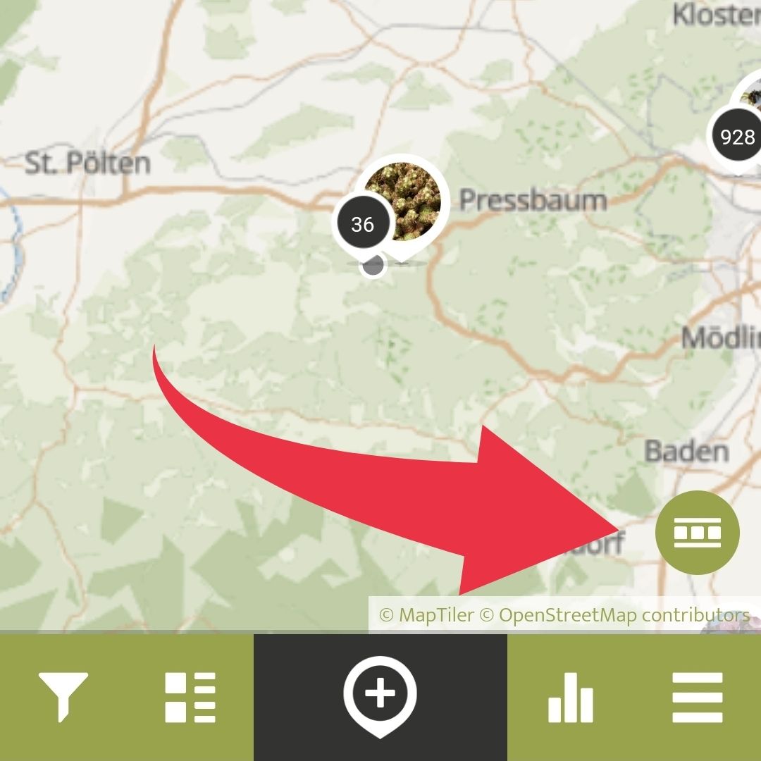
By clicking the Data Visualisation Overlay button, you can see different data visualisations of Spots within the app.
Currently, you can choose between two different kinds of visualisations, the classic heatmap that shows the density of Spots with colours, or the Distribution Dot Map which is visualised on a grid, with more Spots in bigger, and less in smaller circles.
Run your own App on SPOTTERON?
Please visit the website about the SPOTTERON Platform on www.spotteron.net
Please visit the website about the SPOTTERON Platform on www.spotteron.net
No Trackers - No Ads
This website uses no external trackers, no analytics, just session cookies and values your online privacy.
This website uses no external trackers, no analytics, just session cookies and values your online privacy.