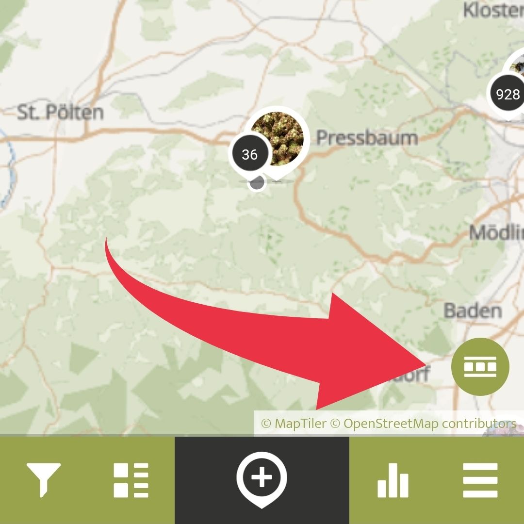
By clicking the Data Visualisation Overlay button, you can see different data visualisations of Spots within the app.
Currently, you can choose between two different kinds of visualisations, the classic heatmap that shows the density of Spots with colours, or the Distribution Dot Map which is visualised on a grid, with more Spots in bigger, and less in smaller circles.